
international holocaust film festival. safety jacket. IDEA. 24 logotypes. cars. websites.
24 logotypes and typefaces.
To better understand 24 different typefaces, my Typography 1 professor tasked us with creating 24 logotypes from each different typeface. I combined two different characters to create a new character that looked like it still fit into the typeface I pulled from.


After I created the logotypes, I began working on putting together a book, featuring the 24 logotypes and typefaces. I began by creating art using a letter from each typeface.I focused on the rotational value of each letter I chose, exploring its relation to itself. Below is a sample of the art I created for my first draft.

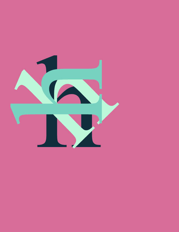


I received feedback that the works did not feel dynamic enough. Since each singular form had movement, the thought was that the piece as a whole should move as well. I revised this in my next rendition. I also was advised that maybe the pink was not the right choice, so instead, I found a lighter orange to complete the palette.

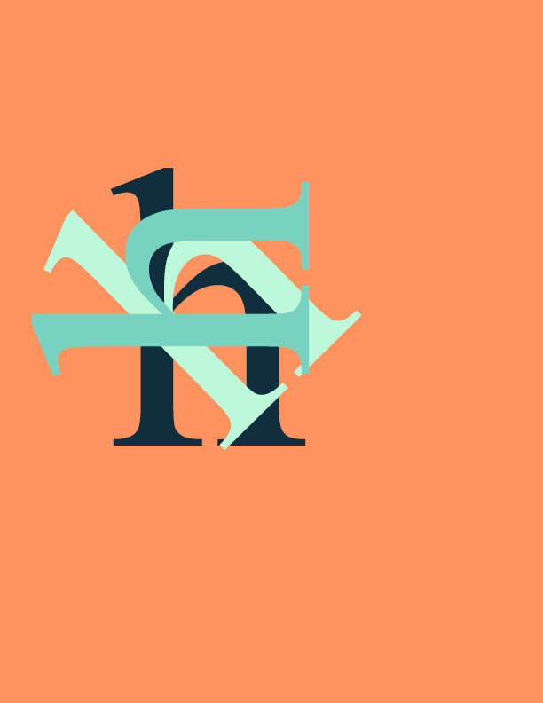


Above is the second draft of the art pieces. After this stage, only small changes were made, including excluding some character combination to make the art seem less cluttered and more refined. This allowed the individual letters to breathe more and appear to fall right off the page. Below, are the final pages from the book once everything was put together and designed.

